
Content Management Systems
- Drupal
- WordPress
- Theming
- Workflow
- Module
- Plugin Development

WebFirst, Inc., a Redhawk Company, designs user-centered websites and digital services, from research and site maps to responsive, mobile-first visual design. WebFirst follows standards such as Section 508, US Digital Design, and FISMA to ensure inclusive, compliant experiences.
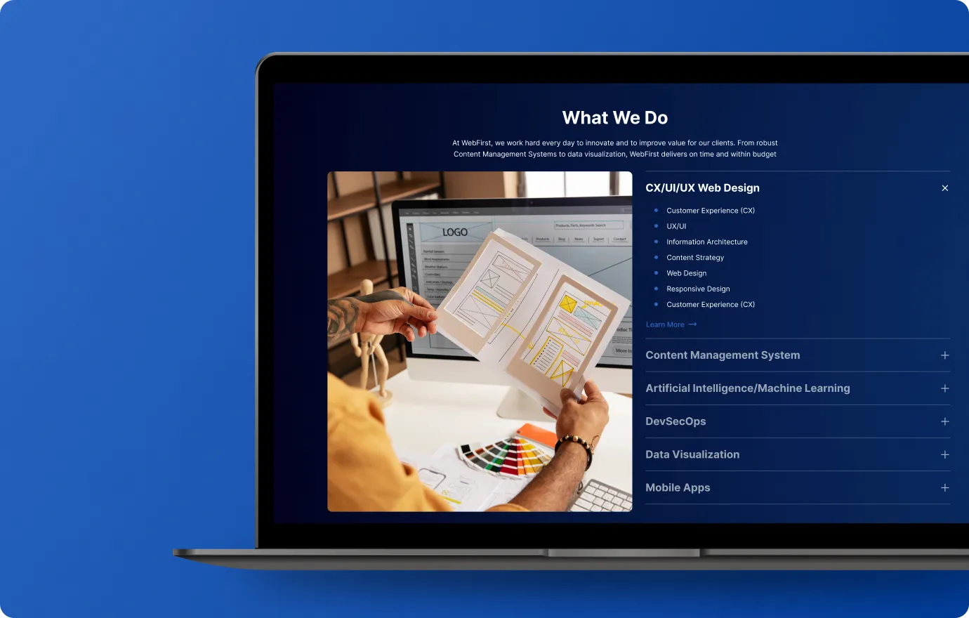
What makes a site engaging and usable? A strong design process based on a user-centric design approach that follows Customer Experience (CX) best practices. Web and mobile site design should be usable, obvious and self-explanatory. We follow standards such as Section 508, US Digital Design, and FISMA to ensure inclusive, compliant experiences.
Our research process combines data analysis and direct user feedback to uncover actionable insights



Mobile first design involves designing for the smallest screen first, then progressively adding more features and content for larger and larger screens. If the site content works on a mobile site, the content will work across all screen sizes. This design is more content focused and user focused. Following a strong UX/UI responsive design process, will result in high quality website that is accessible to the widest possible audience.

A sitemap is an effective planning tool for designers and developers. The sitemap helps to create organization and streamline the number of pages.

Wireframes are analogous to a blueprint of a new house construction. Give you a sense for what the site will look like without colors, fonts, and other specific visual elements.

Creative Briefs are a strong way of collecting design requirements and branding standards. Very important as a functional basis for the site design.
Where content clarity meets design excellence

Define a voice and message that reflect your agency’s goals and values.

Align structure and storytelling with your target audiences and accessibility standards.

Support outreach with clear, measurable communication strategies.

Write with clarity, consistency, and purpose – every line guides users toward action.

Every layout begins with the user in mind. We design websites that are intuitive, accessible, and visually consistent across all devices.

Our interfaces are built for flexibility and speed – adapting seamlessly to phones, tablets, and desktops without sacrificing clarity or performance.

We establish cohesive design systems and style guides to maintain brand integrity and improve long-term scalability.

From dashboards to infographics, we turn complex information into clear, meaningful visuals that support informed decisions.
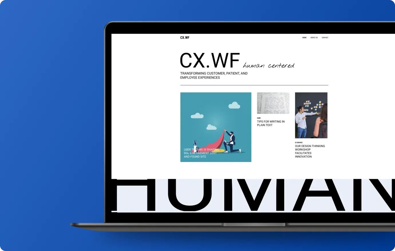
Featured Resource
CX.WF is where design thinking meets real-world impact. We’re a team of UX, UI, service design, and content strategy experts focused on transforming customer and employee experiences in government and healthcare. From AI-driven design to agile solutions, we share insights, tools, and stories that shape human-centered digital transformation in regulated industries.
WebFirst follows standards such as Section 508, US Digital Design, and FISMA to ensure inclusive, compliant experiences.
WebFirst’s research process combines data analysis and direct user feedback through focus groups, online surveys, client interviews, analytics reviews, and content audits.
Mobile first design involves designing for the smallest screen first, then progressively adding more features and content for larger and larger screens. If the site content works on a mobile site, the content will work across all screen sizes.
WebFirst creates site maps, wireframes, and creative briefs. Wireframes give a sense of what the site will look like without colors, fonts, and other specific visual elements, and creative briefs collect design requirements and branding standards.